Nothing is in your cart.
Keep shopping!
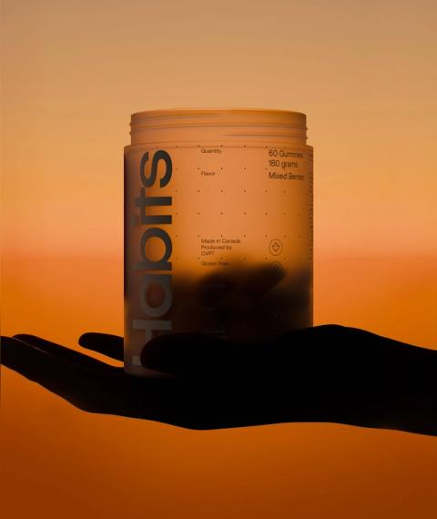
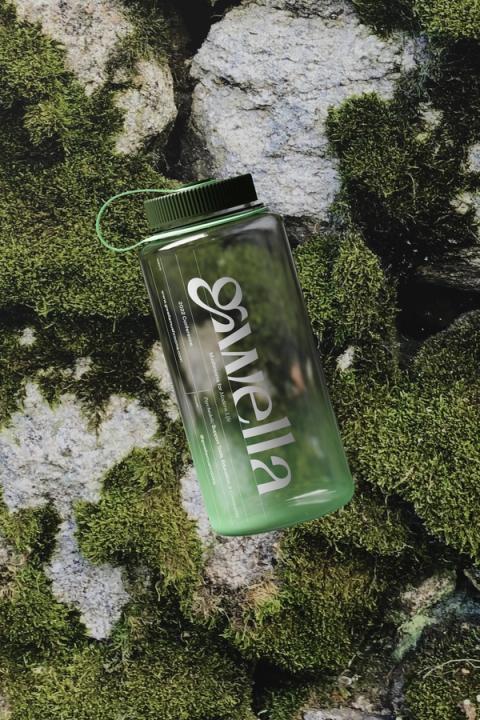
Milamend, a groundbreaking hormone-balancing supplement designed for women experiencing various hormonal imbalances, particularly PCOS, was ready for a global re-launch. Parker was tasked with crafting a new identity that seamlessly blended science and sophistication with warmth and optimism to position Milamend for worldwide success.
2025
- Food & Beverage
- D2C
- Wellness
- Photography
- Brand Identity
- Brand Strategy
- Motion
- Website
- Copywriting
- Art Direction
- Digital Media
- 3D
Website Development: Baggy
Our work on this project was guided by several key objectives, each presenting its own set of challenges that demanded creative and strategic solutions. One of the primary goals was to craft a brand identity that seamlessly balanced two seemingly contrasting qualities: being approachable, conversational, and warm while also embodying the rigor and credibility of a scientifically proven method.
To achieve this, we focused on blending elevated photography, animation, and thoughtful typography. This combination was carefully designed to evoke a sense of cleanliness and professionalism that reinforces the brand’s scientific credibility. At the same time, it maintains a warm, familiar, and personable tone, reflecting the approachable personality and vision of the founder, Mila Magnani.
The result is a brand that serves as more than just a visual identity—it acts as a platform for fostering community and connection. This identity supports the launch of a groundbreaking product aimed at empowering women around the world, helping them feel seen, understood, and supported in their journey. By aligning the brand’s visual and emotional language with its mission, we ensured that it resonates deeply with its target audience while remaining rooted in trust and authenticity.
- Visit Website: milamend.com
- Site Developed: Baggy


