My cart
Nothing is in your cart.
Keep shopping!
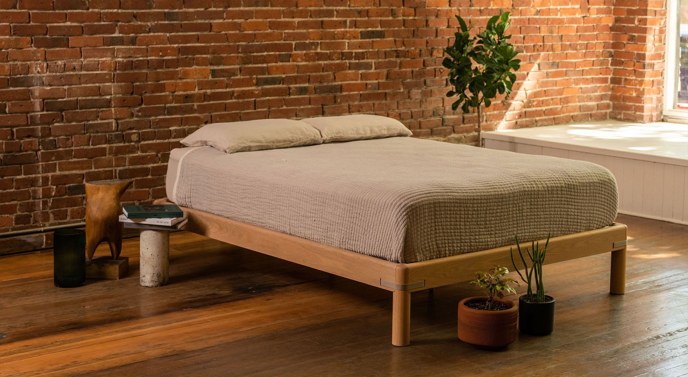
Keeps makes beautiful, sustainably sourced, high-quality furniture available to everyone. Co-owners Andrew and Rob came to us for a visual identity and supporting applications as they prepared for launch.
Year
2021
Industries
- Green Design
- Lifestyle
Services
- Brand Strategy
- Brand Identity
- Photography
- Art Direction
- Print & Packaging
- Digital Media
Credit
Creative Direction: Parker
Photography: Kyle Johnson
Copywriting: Thomas E. McCracken
Our challenge in developing the keeps identity was to design something that felt high-end, but wouldn’t immediately be confused for something that’s mass produced. “Fast furniture sucks” became our driving phrase as we made creative decisions through brand strategy, positioning, and through the brand’s development.
- Follow: Instagram
- Website: Built for Keeps


