Nothing is in your cart.
Keep shopping!
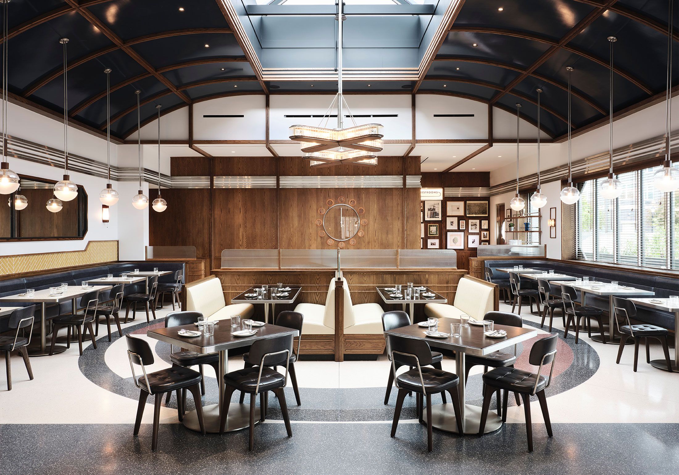
An institution (Interior by Parts & Labor Design)
Consistently rated as New Jersey’s best, Tops is a family-owned classic diner in East Newark serving 15,000–20,000 customers each week. Parker developed a brand that celebrates both Tops' rich history and forward-looking mindset.
2022
- Hospitality
- Brand Identity
- Illustration
- Signage & Wayfinding
- Digital Media
- Print & Packaging
Parts and Labor Design — Architecture and Interiors
Beau Parent — Design and Hand Lettering

Our brand, developed in tandem with interior design by New York's Parts and Labor Design , is intended to maintain a sense of history and place. The primary challenge was finding a way to elevate the diner's visual brand vibe without disconnecting it from its down-to-earth roots.


Our primary display typeface, Bureau Grotesque, provides a confident yet classic aesthetic that nods to the heyday of the previous Tops Diner, built in the mid-80's.


Illustrations pepper the interior wayfinding system, providing an appropriate level of personality to an otherwise buttoned-up space. “Toni” and “Teddy” find their way into as many places as possible.


Secondary Touchpoints
A variety of secondary touchpoints draw inspiration from the many eras of Tops’ history. Matchbooks, coasters, mugs, and apparel utilize a variety of secondary typefaces.


Wayfinding
We designed a timeless wayfinding system that compliments the materials used throughout the space. Brushed stainless steal and white acrylic light-boxes pay homage to the design of the original Tops location.

- Visit: Tops Diner
- Website: Check It Out


